
Increasing cart checkout rate for Oyela App
Increasing cart checkout rate for Oyela App
Oyela | Ecommerce | B2C | Product Design
Oyela | Ecommerce | B2C | Product Design
About Oyela ?
About Oyela ?
About Oyela ?
Step into the rhythm of fashion commerce with Oyela.in, where style takes center stage. Imagine Oyela as a vibrant fashion runway, where fashion enthusiasts come together to strut their stuff, connect with like-minded individuals, and unleash their fashion flair. In this digital realm, buyers and sellers dance to the beat of fashion commerce, creating a vibrant ecosystem that pulsates with possibility.
Step into the rhythm of fashion commerce with Oyela.in, where style takes center stage. Imagine Oyela as a vibrant fashion runway, where fashion enthusiasts come together to strut their stuff, connect with like-minded individuals, and unleash their fashion flair. In this digital realm, buyers and sellers dance to the beat of fashion commerce, creating a vibrant ecosystem that pulsates with possibility.
Step into the rhythm of fashion commerce with Oyela.in, where style takes center stage. Imagine Oyela as a vibrant fashion runway, where fashion enthusiasts come together to strut their stuff, connect with like-minded individuals, and unleash their fashion flair. In this digital realm, buyers and sellers dance to the beat of fashion commerce, creating a vibrant ecosystem that pulsates with possibility.


A Basic Overview!
A Basic Overview!
A Basic Overview!
I proudly spearheaded the comprehensive design of the remarkable Oyela app, leaving no stone unturned. Within this illustrious case study, we shall delve into the extraordinary feature known as the 'single payment link' - a brainchild born from our innovative minds and masterfully crafted by my unwavering expertise.
I proudly spearheaded the comprehensive design of the remarkable Oyela app, leaving no stone unturned. Within this illustrious case study, we shall delve into the extraordinary feature known as the 'single payment link' - a brainchild born from our innovative minds and masterfully crafted by my unwavering expertise.
I proudly spearheaded the comprehensive design of the remarkable Oyela app, leaving no stone unturned. Within this illustrious case study, we shall delve into the extraordinary feature known as the 'single payment link' - a brainchild born from our innovative minds and masterfully crafted by my unwavering expertise.
My Role
Researching thoroughly to uncover hidden possibilities and insights.
Igniting creativity by exploring new ideas and pushing limits.
Overcoming challenges to find the best solution with unwavering determination.
Fearlessly testing and refining ideas based on user feedback.
Creating user-friendly interfaces that captivate and provide seamless experiences.
Timeline
6 days
6 days
6 days
Team
Anjan (co-founder cum PM).
Anjan (co-founder cum PM).
Anjan (co-founder cum PM).
Kanishqa (Developer)
Kanishqa (Developer)
Kanishqa (Developer)
Myself (UI/UX Designer)
Myself (UI/UX Designer)
Myself (UI/UX Designer)
Tools
Adobe XD
Adobe XD
Adobe XD
Adobe Illustrator
Adobe Illustrator
Adobe Illustrator
Adobe Figma
Adobe Figma
Adobe Figma
Let's compare how people shop fashion stuffs through Instagram vs Oyela.
Let's compare how people shop fashion stuffs through Instagram vs Oyela.
Let's compare how people shop fashion stuffs through Instagram vs Oyela.
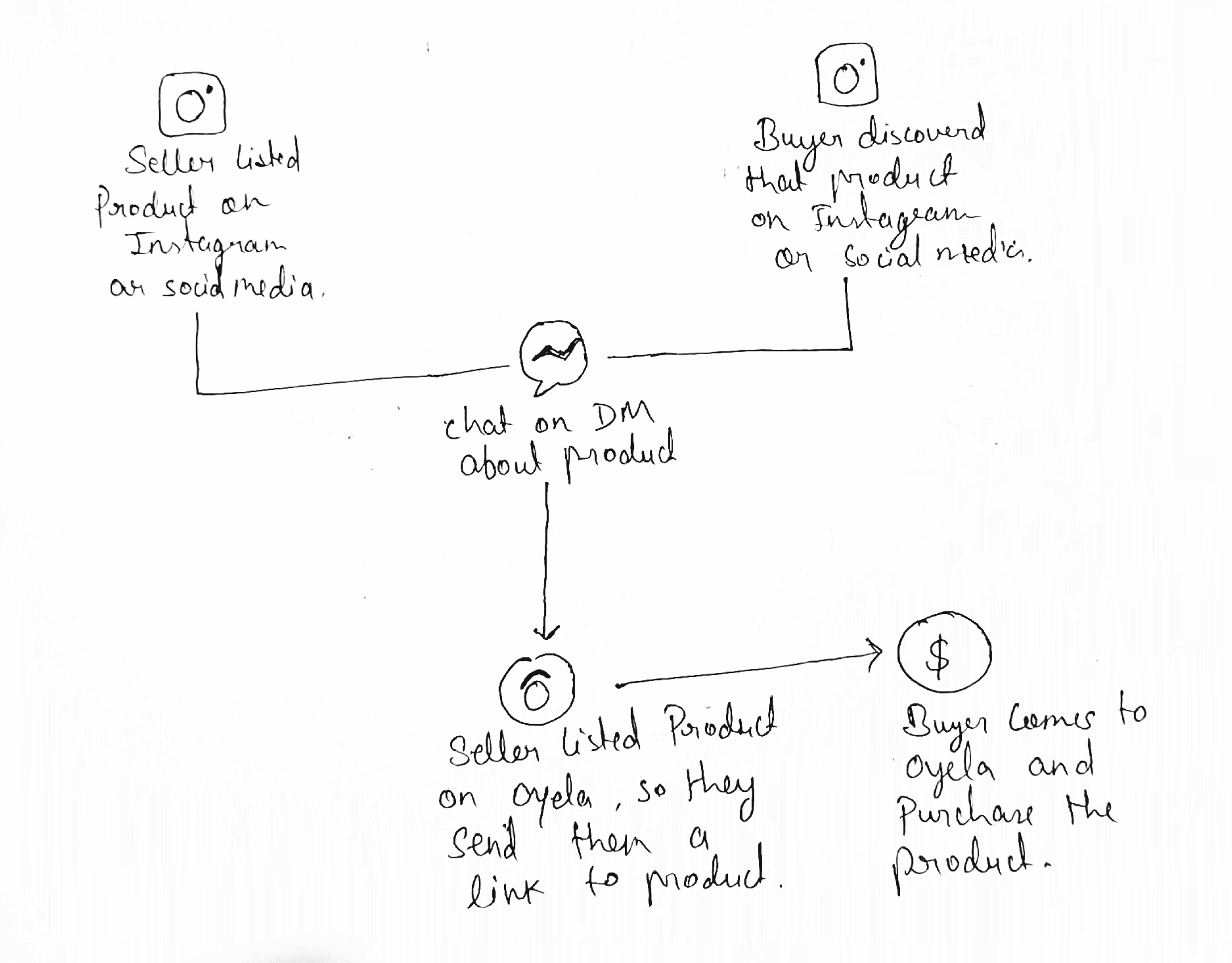


On Instagram, it's simple.
On Instagram, it's simple.
Find something you like
Give the seller your shipping details
Pay online.
wait for your product to be delivered.
Find something you like
Give the seller your shipping details
Pay online.
wait for your product to be delivered.
Find something you like
Give the seller your shipping details
Pay online.
wait for your product to be delivered.
Easy Right !
Easy Right !
But when buying on the Ecommerce websites or Oyela, there are more steps involved
But when buying on the Ecommerce websites or Oyela, there are more steps involved
Login
Registration
Add product to cart
Apply suitable coupon
Add detailed Address
Pay online
Login
Registration
Add product to cart
Apply suitable coupon
Add detailed Address
Pay online
Login
Registration
Add product to cart
Apply suitable coupon
Add detailed Address
Pay online
It can be a bit of hassle
It can be a bit of hassle
Buyers don't want all these extra steps and complications when they're trying to buy something. On the other hand, sellers on Oyela have to deal with managing all the orders and shipping, which can be a lot of work for them.
Buyers don't want all these extra steps and complications when they're trying to buy something. On the other hand, sellers on Oyela have to deal with managing all the orders and shipping, which can be a lot of work for them.
Buyers don't want all these extra steps and complications when they're trying to buy something. On the other hand, sellers on Oyela have to deal with managing all the orders and shipping, which can be a lot of work for them.
Challenge of the project
Challenge of the project
Challenge of the project
Picture this: a buyer discovers a fashion gem through social media, and with a few simple steps, effortlessly completes the purchase. However, when navigating the Oyela platform, the checkout process becomes a labyrinth, hindering the buyer's excitement.
Our challenge became clear: How might we reduce buyer effort during the checkout process and empower sellers to increase conversions on Oyela?
Sounds challenging right ??? Yeah, so as Life!
Sounds challenging right ??? Yeah, so as Life!
How we Identified the Problem?
How we Identified the Problem?
How we Identified the Problem?
To unearth the secrets behind the flawed checkout experience, we embarked on a journey of deep empathy, engaging in candid conversations with our sellers.
To unearth the secrets behind the flawed checkout experience, we embarked on a journey of deep empathy, engaging in candid conversations with our sellers.
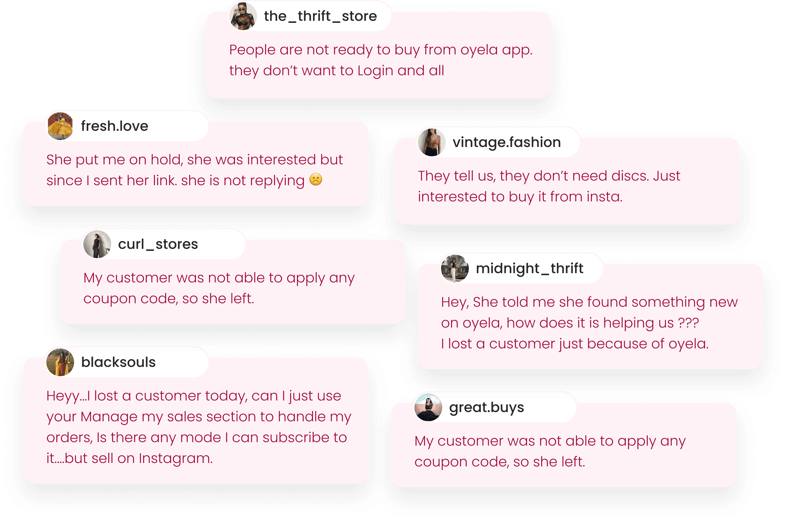


We sought answers to critical questions:
How does any customer discover you?
How does they approach you?
What are common questions they ask?
How does they initiate the purchase?
What information they share with you?
What are the problems they are facing while purchasing through our platform?
What are your challenges in that scenario?
How do you proceed in such cases?
How does this problem impacts you? etc.
The insights gleaned were eye-opening👁️👁️ for us
The insights gleaned were eye-opening👁️👁️ for us
Buyers yearned for simplicity and convenience, preferring the seamless experience of purchasing through social media.
They hesitated to trust a new brand, and the cumbersome steps of the Oyela checkout process left them disenchanted.
Sellers faced their own challenges, with potential buyers abandoning purchases after receiving links.
What were the causes ?
What were the causes ?
What were the causes ?
Peering into the intricate maze of the checkout process, we discovered the culprits behind the confusion.
Peering into the intricate maze of the checkout process, we discovered the culprits behind the confusion.
Buyers craved simplicity and detested the need to navigate additional links.
Buyers craved simplicity and detested the need to navigate additional links.
Buyers craved simplicity and detested the need to navigate additional links.
Trust became a significant obstacle, as our brand was new and unfamiliar.
Trust became a significant obstacle, as our brand was new and unfamiliar.
Trust became a significant obstacle, as our brand was new and unfamiliar.
the arduous tasks of applying coupons and entering addresses added to the complexity.
the arduous tasks of applying coupons and entering addresses added to the complexity.
the arduous tasks of applying coupons and entering addresses added to the complexity.
Sellers faced their own challenges, witnessing potential buyers dropping off after receiving links.
Sellers faced their own challenges, witnessing potential buyers dropping off after receiving links.
Sellers faced their own challenges, witnessing potential buyers dropping off after receiving links.
Some even preferred paying full price on social media platforms to bypass the hassle.
Some even preferred paying full price on social media platforms to bypass the hassle.
Some even preferred paying full price on social media platforms to bypass the hassle.
Getting a link also made buyers feel like, they can purchase the product anytime, so they do not hurry, and hence It gets out of stock easily.
Getting a link also made buyers feel like, they can purchase the product anytime, so they do not hurry, and hence It gets out of stock easily.
Getting a link also made buyers feel like, they can purchase the product anytime, so they do not hurry, and hence It gets out of stock easily.
Moreover, the phone number-centric login process deterred users who were uncomfortable sharing personal information.
Moreover, the phone number-centric login process deterred users who were uncomfortable sharing personal information.
Moreover, the phone number-centric login process deterred users who were uncomfortable sharing personal information.
What were the Design constraints?
What were the Design constraints?
What were the Design constraints?
we confronted unique design constraints head-on.
There were no existing solutions in the market that could address our specific challenge, leaving us no choice but to forge ahead on uncharted territory.
The clock was ticking.
Checkout rates were dwindling.
We embraced the constraints and fueled our creativity, driven by the passion to create something truly groundbreaking.
Brewing Ideas, Brainstorming concepts!
Brewing Ideas, Brainstorming concepts!
Brewing Ideas, Brainstorming concepts!

This meticulous process ensured that our solutions were rooted in a deep understanding of the challenges faced by buyers and sellers, and that they addressed each pain point with precision and finesse.
This meticulous process ensured that our solutions were rooted in a deep understanding of the challenges faced by buyers and sellers, and that they addressed each pain point with precision and finesse.
Thoroughly examining each cause and conducting comprehensive interviews, we dived deep into the pain points experienced by both buyers and sellers.
Our mission was to understand the essence of their troubles, extracting critical information that could pave the way for transformative solutions.
To make sense of the complexity, we broke down the overarching problems into smaller, manageable fragments.
Focused on addressing each fragment of the problem in the most efficient and effective way, we aimed to provide impactful solutions.
Once we had developed efficient solutions for each individual problem fragment, we set out to connect the dots, seamlessly merging them into a cohesive and comprehensive solution.
Outcomes of Brainstorming
Outcomes of Brainstorming
Outcomes of Brainstorming
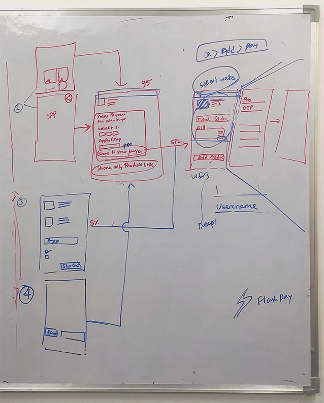


After intense hours of contemplation and weaving ideas together, our brainstorming session yielded a plethora of possibilities. From the wealth of ideas generated, we carefully selected the top 3 ideas that aimed to revolutionize the fashion commerce experience:
After intense hours of contemplation and weaving ideas together, our brainstorming session yielded a plethora of possibilities. From the wealth of ideas generated, we carefully selected the top 3 ideas that aimed to revolutionize the fashion commerce experience:
After intense hours of contemplation and weaving ideas together, our brainstorming session yielded a plethora of possibilities. From the wealth of ideas generated, we carefully selected the top 3 ideas that aimed to revolutionize the fashion commerce experience:
System Bypass: Introduce a seamless system bypass for users during their first transaction, eliminating unnecessary steps and streamlining the checkout process.
Workload Optimization: Transfer the buyer's workload to sellers in an optimized manner, empowering them to manage orders and shipping seamlessly, while reducing the burden on buyers.
Invisible Intermediary: Create an intermediary channel where buyers can effortlessly login and join our platform, without even realizing they have transitioned from their original social media discovery.
These innovative solutions were meticulously crafted to address the pain points identified during our research and empower both buyers and sellers in the world of fashion commerce. With these ideas at the forefront, we were ready to embark on the next phase of testing and refinement.
These innovative solutions were meticulously crafted to address the pain points identified during our research and empower both buyers and sellers in the world of fashion commerce. With these ideas at the forefront, we were ready to embark on the next phase of testing and refinement.
These innovative solutions were meticulously crafted to address the pain points identified during our research and empower both buyers and sellers in the world of fashion commerce. With these ideas at the forefront, we were ready to embark on the next phase of testing and refinement.
Task flow of the concept
Task flow of the concept
Task flow of the concept
This task flow concept aims to simplify the fashion commerce experience for both buyers and sellers on the Oyela platform. By implementing the innovative solutions of system bypass, workload optimization, and invisible intermediaries, we have streamlined the entire process, eliminating unnecessary steps and reducing user effort. The result is a seamless, convenient, and delightful fashion commerce journey for all users involved.
This task flow concept aims to simplify the fashion commerce experience for both buyers and sellers on the Oyela platform. By implementing the innovative solutions of system bypass, workload optimization, and invisible intermediaries, we have streamlined the entire process, eliminating unnecessary steps and reducing user effort. The result is a seamless, convenient, and delightful fashion commerce journey for all users involved.
This task flow concept aims to simplify the fashion commerce experience for both buyers and sellers on the Oyela platform. By implementing the innovative solutions of system bypass, workload optimization, and invisible intermediaries, we have streamlined the entire process, eliminating unnecessary steps and reducing user effort. The result is a seamless, convenient, and delightful fashion commerce journey for all users involved.


Our Initial Concept !
Our Initial Concept !
Our Initial Concept !
Through the initial concept, we showcase the outcomes of our rigorous brainstorming sessions. We present the top three ideas that emerged as the most promising solutions: providing a system bypass for users during their first transaction, optimizing the workload for sellers, and creating an invisible intermediary channel to seamlessly transition buyers to the Oyela platform.
This section serves as the foundation for the subsequent stages of our UX design process. It lays the groundwork for addressing the identified problems and serves as a guide for the creation of a streamlined task flow and user-centric features.


Testing and its Feedbacks
Testing and its Feedbacks
Testing and its Feedbacks
To validate our initial concept and gather valuable insights, we conducted user testing with a group of sellers and buyers. By sharing our concept screens and observing their interactions during the checkout process, we obtained crucial feedback that allowed us to refine and improve our design.
Based on the feedback from 4-5 users across two testing sessions, we identified several usability and UX issues that required attention. While seemingly small, these issues held significant potential to enhance the overall user experience and drive engagement on the Oyela platform. The key feedback received includes:
Shield should be an option, not compulsion
Shield should be an option, not compulsion
We redesigned the shield option to make it optional, allowing users to choose whether they want to avail themselves of the refund/return services and additional discounts.
Bundle for buyer must look more personalized
Bundle for buyer must look more personalized
The "Bundle for Buyer" page underwent a makeover, focusing on a personalized experience while seamlessly merging the shield feature to eliminate confusion and extra charges.
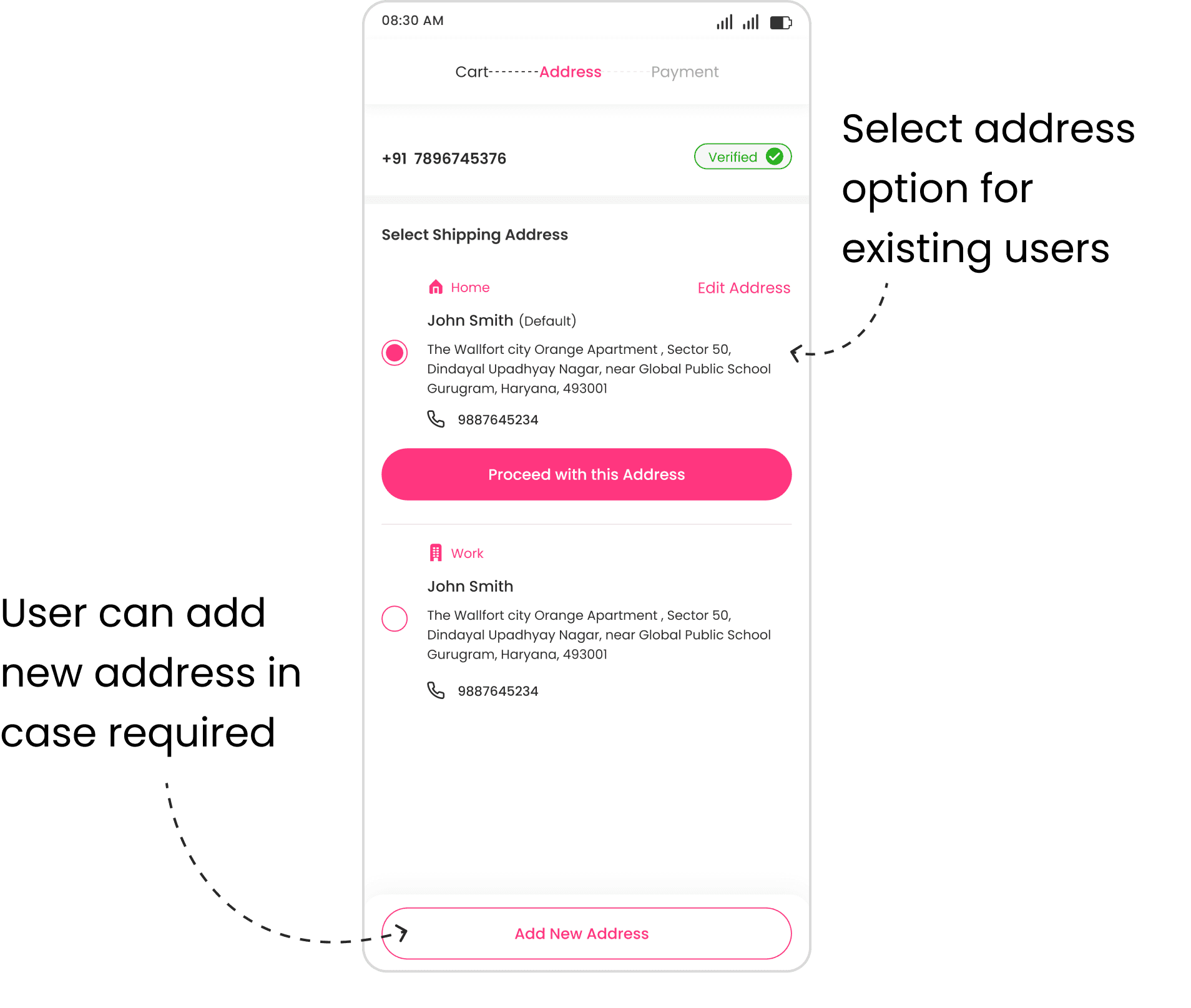
Select address for existing users
Select address for existing users
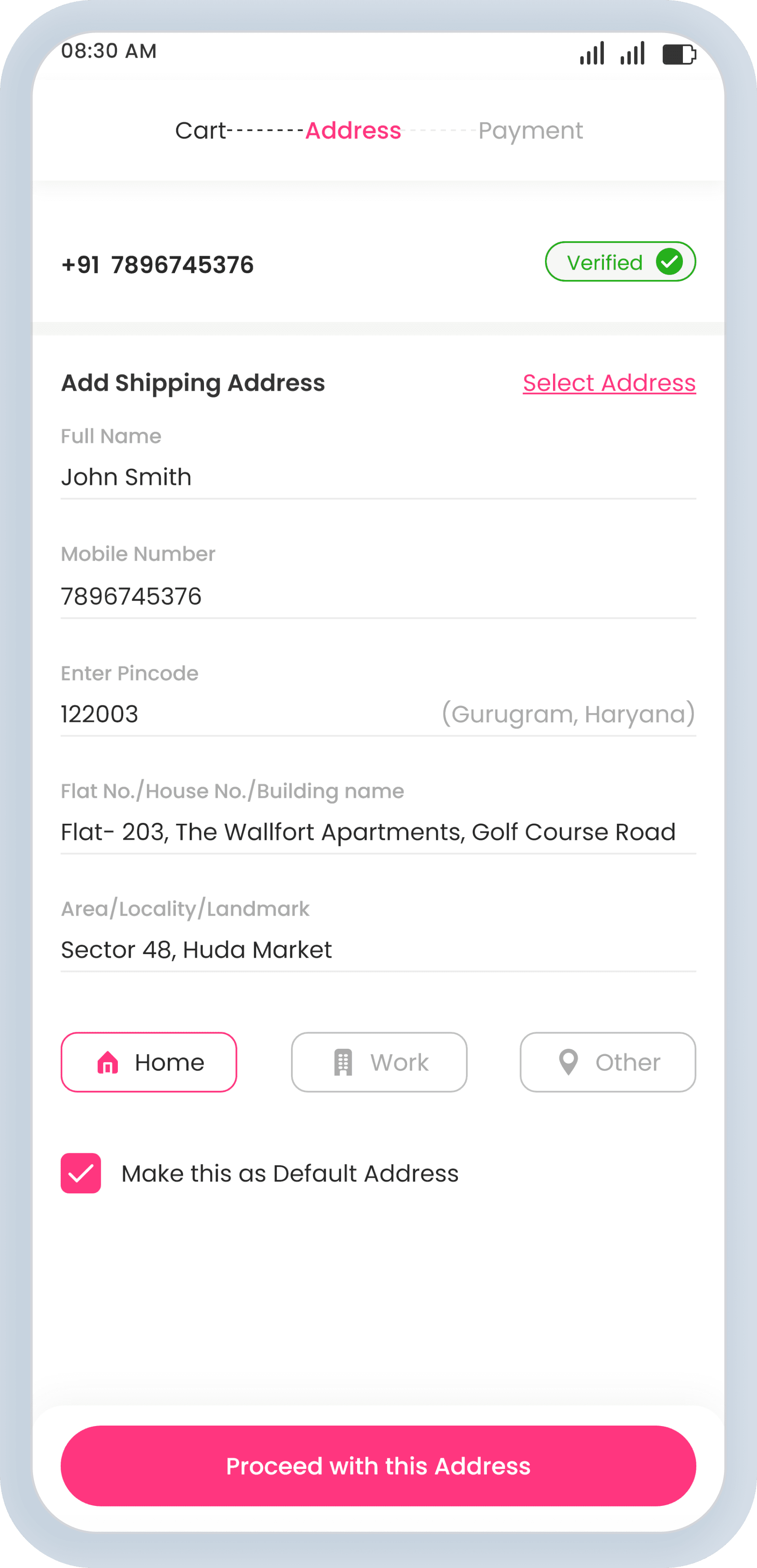
To improve efficiency, we introduced a select address option for existing users, eliminating the need for them to repeatedly enter their address during each purchase.
Iterations and Iterations
Iterations and Iterations
Iterations and Iterations
Based on the valuable feedback received, we made significant changes to enhance user-friendliness and accommodate a larger user base.
Based on the valuable feedback received, we made significant changes to enhance user-friendliness and accommodate a larger user base.
Based on the valuable feedback received, we made significant changes to enhance user-friendliness and accommodate a larger user base.


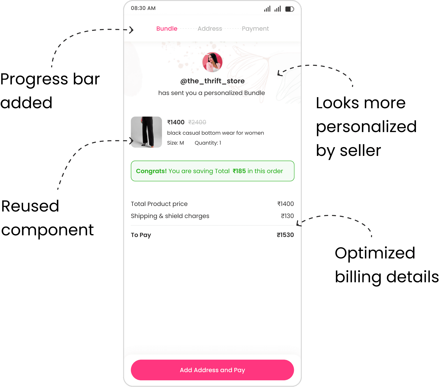




Final Design Screens
Final Design Screens
Final Design Screens
Let's jump into the final Design flow of the process and understand the complete picture.
Let's jump into the final Design flow of the process and understand the complete picture.
Let's jump into the final Design flow of the process and understand the complete picture.


SPP (Single product page)


Create Bundle


Bundle for buyer


Add Address-6
Conclusion
Conclusion
Conclusion
As the dust settled and our solution took flight, we witnessed a remarkable transformation of Increased checkout conversion rate for social media buyers to almost 90% in the Oyela ecosystem. Buyers now reveled in a hassle-free checkout experience, free from the burden of multiple steps and cumbersome tasks. Meanwhile, sellers witnessed an upsurge in conversions, as the innovative solutions fostered trust and engagement. Oyela became the go-to destination for fashion enthusiasts, where effortless commerce and vibrant community converge.
As the dust settled and our solution took flight, we witnessed a remarkable transformation of Increased checkout conversion rate for social media buyers to almost 90% in the Oyela ecosystem. Buyers now reveled in a hassle-free checkout experience, free from the burden of multiple steps and cumbersome tasks. Meanwhile, sellers witnessed an upsurge in conversions, as the innovative solutions fostered trust and engagement. Oyela became the go-to destination for fashion enthusiasts, where effortless commerce and vibrant community converge.
Reflections
Reflections
Reflections
Embarking on my first E-commerce project was an exhilarating journey of discovery and growth. Collaborating with a dedicated team, we transformed ideas into tangible solutions that seamlessly integrated into the Oyela ecosystem. Witnessing the positive impact on both buyers and sellers was incredibly rewarding, affirming the power of design in shaping user behavior.
The process demanded that I stretch my creative muscles, challenge conventional thinking, and explore new horizons. It was an adventure that pushed me outside my comfort zone and propelled my growth as a designer.
This project taught me the value of perseverance and adaptability in the design process. It ignited a deep passion for UX design in the e-commerce space and instilled in me a drive to continue pushing boundaries and creating exceptional user experiences. Armed with the lessons learned and the excitement for future endeavors, I am eager to shape the future of e-commerce through user-centered design.
UI
UI
UI
BOTH
BOTH
BOTH
CAN
CAN
CAN
TOGETHER
TOGETHER
TOGETHER
BECOME
BECOME
BECOME
A
A
A
GREAT
GREAT
GREAT
TEAM
TEAM
TEAM
LET'S
LET'S
LET'S
CONNECT?
CONNECT?
CONNECT?
✦
Crafted with _____ Designed in _______
Crafted with L ve, Designed in Framer
Crafted with _____ Designed in _______
✦
© Narendra Gupta 2024
© Narendra Gupta 2024
