Personalising Exam preparation using AI and Habit forming UX Gamification
Personalising Exam preparation using AI and Habit forming UX Gamification
Personalising Exam preparation using AI and Habit forming UX Gamification
Ed-tech | B2C | mobile app | AI-powered
Ed-tech | B2C | mobile app | AI-powered
Ed-tech | B2C | mobile app | AI-powered


Quick Scan (2mins)
Full Casestudy (8mins)
We are living in a world where…

Udit, a full-time aspirant, spends 10 hours a day poring over books and attending coaching classes, yet still feels unsure about his readiness.
Shreya, the ambitious multitasker, juggles a demanding 9-to-5 job and squeezes study sessions into her weekends and late nights.
Both have big dreams but vastly different routines—and they’re up against the same competitive exam.
We have millions of Udit & Shreya preparing for competitive exams, each with unique challenges but a shared frustration: the system isn’t built for them.
Why Quiz-Based and AI-Driven?
Quiz-Based Learning because:
Competitive exams are quiz-based, so we mirror real exam formats.
Quizzes highlight weaknesses and reinforce strengths.
Time constraints? Quizzes fit into any schedule.
AI powered because:
AI analyzes your strengths and weaknesses faster than a human could
It serves personalized revisions on a silver platter, and ensures no time is wasted.
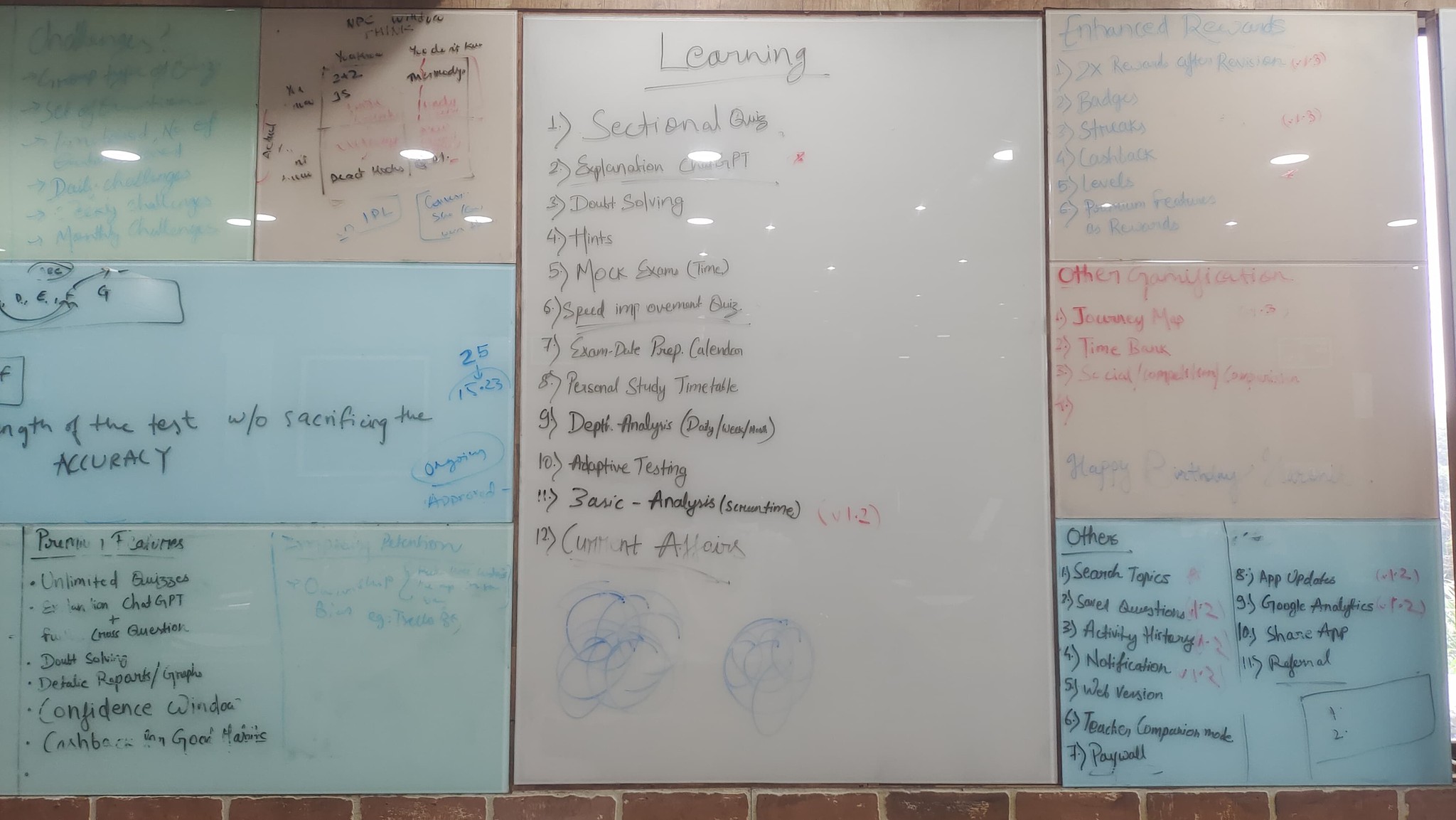
AI identifies weaknesses, adjusts quiz content, and suggests focused practice.
Example: Shreya struggled with Quantitative Aptitude, often avoiding it. Netpractice identified this weakness, pushed targeted quizzes, and guided her to improvement—all while keeping her motivated with small rewards.


What should I focus on?

Why does everyone learn the same way?

Will I even remember this?

Where am I going with my preparation?

Why is there SO much material?

Do I have enough time?

What if I fail?

This is so boring!!
Let’s be real—exam prep isn’t a walk in the park. It’s more like running a marathon with a backpack full of rocks. Udit and Shreya face the same recurring issues:
Have you met, Netpractice?
Netpractice is here to rewrite the rules of preparation, Because Every Hero Needs Superpowers
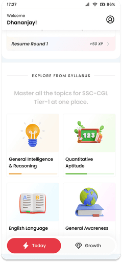
Personalized Test and Learning Paths
1
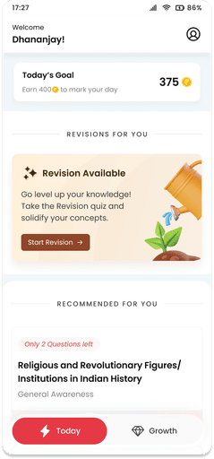
No more one-size-fits-all. Netpractice adapts to every user—whether it’s Udit tackling mock tests or Shreya revising weak areas at midnight. With AI in the driver’s seat, every quiz feels custom-made, ensuring students focus on exactly what matters.
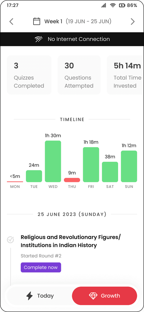
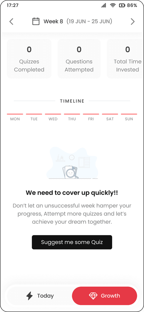
Tracking Progress and Retaining Knowledge:
2
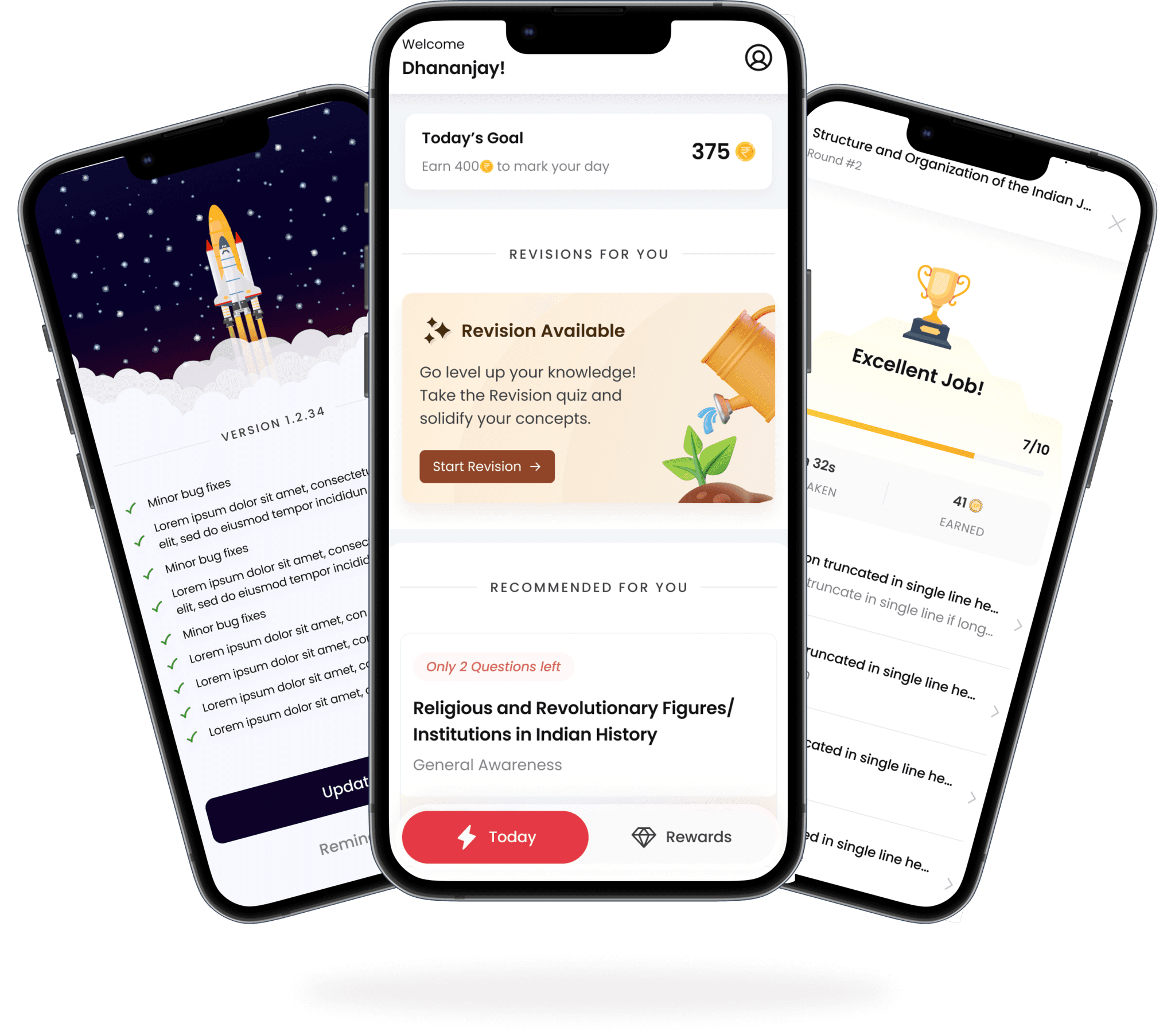
Our AI-powered timeline and revision tracker ensure no topic is forgotten. The system not only sets realistic plans based on your schedule but also sends timely revision reminders with fresh, relevant questions. Think of it as a GPS for your exam prep, guiding you at every step.
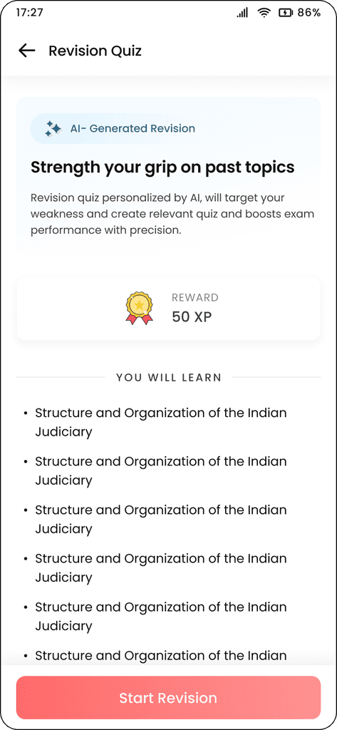
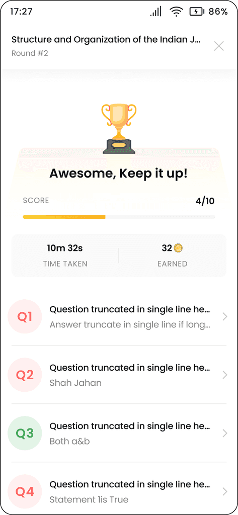
Making Studying Engaging with Gamification:
3
Imagine if every study session felt like a mini-victory. At Netpractice, we’ve turned studying into a game, breaking down large topics into bite-sized goals and rewarding users for each milestone achieved. It’s like unlocking levels in a video game—except here, the prize is confidence.
Well, Did It Work?
Daily Active Users (DAU) jumped by 30%
Revision Completion Rate (RCR) hit 58%, proving our algorithm works
User Retention skyrocketed to 77%
Average session lengths increased by 43%, Gamification's magic
100k+ downloads in just 6 months
Maybe it's too soon to call it a revolution! But these numbers tells, we are in a right direction.
Are we done? Not at all.
The possibilities are limitless—and we’re here to explore every one of them.
Imagine a world where every student—whether it’s Udit or Shreya—prepares with confidence, knowing they have the tools to succeed. Netpractice doesn’t just solve problems; it transforms how we approach learning. It’s not about working harder—it’s about working smarter, retaining more, and staying motivated.
This is just the beginning of a journey to redefine education with innovation, empathy, and, of course, a little help from AI.
As we reflect on the journey of Netpractice, one thing stands out—it’s not just a product; it’s an innovation with personalization in how students prepare for competitive exams. Udit feels less overwhelmed. Shreya feels more confident. Together, they’re proof that when technology meets empathy, anything is possible.

Quick Scan (2min)
Casestudy (8min)
We are living in a world where…
Udit, a full-time aspirant, spends 10 hours a day poring over books and attending coaching classes, yet still feels unsure about his readiness.
Shreya, the ambitious multitasker, juggles a demanding 9-to-5 job and squeezes study sessions into her weekends and late nights.
Both have big dreams but vastly different routines—and they’re up against the same competitive exam.
We have millions of Udit & Shreya preparing for competitive exams, each with unique challenges but a shared frustration: the system isn’t built for them.


Why Quiz-Based and AI-Driven?
Quiz-Based Learning because:
Competitive exams are quiz-based, so we mirror real exam formats.
Quizzes highlight weaknesses and reinforce strengths.
Time constraints? Quizzes fit into any schedule.
AI powered because:
Competitive exams are quiz-based, so we mirror real exam formats.
Quizzes highlight weaknesses and reinforce strengths.
Time constraints? Quizzes fit into any schedule.
Example: Shreya struggled with Quantitative Aptitude, often avoiding it. Netpractice identified this weakness, pushed targeted quizzes, and guided her to improvement—all while keeping her motivated with small rewards.


What should I focus on?

Why does everyone learn the same way?

Will I even remember this?

Where am I going with my preparation?

Why is there SO
much material?

Do I have
enough time?

What if I fail?

This is so boring!!
Let’s be real—exam prep isn’t a walk in the park. It’s more like running a marathon with a backpack full of rocks. Udit and Shreya face the same recurring issues:
Have you met, Netpractice?
Netpractice is here to rewrite the rules of preparation, Because Every Hero Needs Superpowers
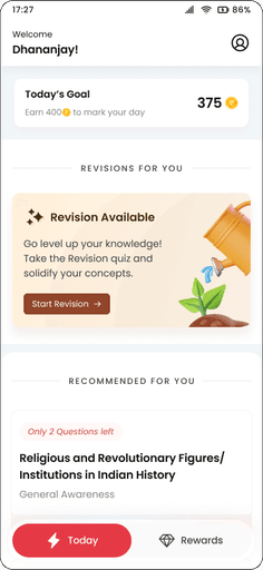
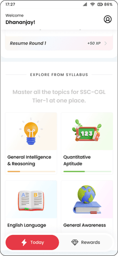
Personalized Test and Learning Paths
1
No more one-size-fits-all. Netpractice adapts to every user—whether it’s Udit tackling mock tests or Shreya revising weak areas at midnight. With AI in the driver’s seat, every quiz feels custom-made, ensuring students focus on exactly what matters.


Tracking Progress and Retaining Knowledge:
2
Our AI-powered timeline and revision tracker ensure no topic is forgotten. The system not only sets realistic plans based on your schedule but also sends timely revision reminders with fresh, relevant questions. Think of it as a GPS for your exam prep, guiding you at every step.


Making Studying Engaging with Gamification:
3
Imagine if every study session felt like a mini-victory. At Netpractice, we’ve turned studying into a game, breaking down large topics into bite-sized goals and rewarding users for each milestone achieved. It’s like unlocking levels in a video game—except here, the prize is confidence.
Well, Did It Work?
Daily Active Users (DAU) jumped by 30%
Revision Completion Rate (RCR) hit 58%, proving our algorithm works
User Retention skyrocketed to 77%
Average session lengths increased by 43%, Gamification's magic
100k+ downloads in just 6 months
Paid users reduces by 12%, Need to figure out pricing again!
73% users browse manually, Recommendation algo needs make-over!
Maybe it's too soon to call it a revolution! But these numbers tells, we are in a right direction.
Are we done? Not at all.
The possibilities are limitless—and we’re here to explore every one of them.
Imagine a world where every student—whether it’s Udit or Shreya—prepares with confidence, knowing they have the tools to succeed. Netpractice doesn’t just solve problems; it transforms how we approach learning. It’s not about working harder—it’s about working smarter, retaining more, and staying motivated.
This is just the beginning of a journey to redefine education with innovation, empathy, and, of course, a little help from AI.
As we reflect on the journey of Netpractice, one thing stands out—it’s not just a product; it’s a revolution in how students prepare for competitive exams. Udit feels less overwhelmed. Shreya feels more confident. Together, they’re proof that when technology meets empathy, anything is possible.

Quick Scan (2min)
Casestudy (8min)
We are living in a world where…
Udit, a full-time aspirant, spends 10 hours a day poring over books and attending coaching classes, yet still feels unsure about his readiness.
Shreya, the ambitious multitasker, juggles a demanding 9-to-5 job and squeezes study sessions into her weekends and late nights.
Both have big dreams but vastly different routines—and they’re up against the same competitive exam.
We have millions of Udit & Shreya preparing for competitive exams, each with unique challenges but a shared frustration: the system isn’t built for them.


Why Quiz-Based and AI-Driven?
Quiz-Based Learning because:
Competitive exams are quiz-based, so we mirror real exam formats.
Quizzes highlight weaknesses and reinforce strengths.
Time constraints? Quizzes fit into any schedule.
AI powered because:
Competitive exams are quiz-based, so we mirror real exam formats.
Quizzes highlight weaknesses and reinforce strengths.
Time constraints? Quizzes fit into any schedule.
Example: Shreya struggled with Quantitative Aptitude, often avoiding it. Netpractice identified this weakness, pushed targeted quizzes, and guided her to improvement—all while keeping her motivated with small rewards.


What should I focus on?

Why does everyone learn the same way?

Will I even remember this?

Where am I going with my preparation?

Why is there SO much material?

Do I have enough time?

What if I fail?

This is so boring!!
Let’s be real—exam prep isn’t a walk in the park. It’s more like running a marathon with a backpack full of rocks. Udit and Shreya face the same recurring issues:
Have you met, Netpractice?
Netpractice is here to rewrite the rules of preparation, Because Every Hero Needs Superpowers


Personalized Test and Learning Paths
1
No more one-size-fits-all. Netpractice adapts to every user—whether it’s Udit tackling mock tests or Shreya revising weak areas at midnight. With AI in the driver’s seat, every quiz feels custom-made, ensuring students focus on exactly what matters.


Tracking Progress and Retaining Knowledge:
2
Our AI-powered timeline and revision tracker ensure no topic is forgotten. The system not only sets realistic plans based on your schedule but also sends timely revision reminders with fresh, relevant questions. Think of it as a GPS for your exam prep, guiding you at every step.


Making Studying Engaging with Gamification:
3
Imagine if every study session felt like a mini-victory. At Netpractice, we’ve turned studying into a game, breaking down large topics into bite-sized goals and rewarding users for each milestone achieved. It’s like unlocking levels in a video game—except here, the prize is confidence.
Well, Did It Work?
Daily Active Users (DAU) jumped by 30%
Revision Completion Rate (RCR) hit 58%, proving our algorithm works
User Retention skyrocketed to 77%
Average session lengths increased by 43%, Gamification's magic
100k+ downloads in just 6 months
Paid users reduces by 12%, Need to figure out pricing again!
73% users browse manually, Recommendation algo needs make-over!
Maybe it's too soon to call it a revolution! But these numbers tells, we are in a right direction.
Are we done? Not at all.
The possibilities are limitless—and we’re here to explore every one of them.
Imagine a world where every student—whether it’s Udit or Shreya—prepares with confidence, knowing they have the tools to succeed. Netpractice doesn’t just solve problems; it transforms how we approach learning. It’s not about working harder—it’s about working smarter, retaining more, and staying motivated.
This is just the beginning of a journey to redefine education with innovation, empathy, and, of course, a little help from AI.
As we reflect on the journey of Netpractice, one thing stands out—it’s not just a product; it’s a revolution in how students prepare for competitive exams. Udit feels less overwhelmed. Shreya feels more confident. Together, they’re proof that when technology meets empathy, anything is possible.

UI
UI
UI
BOTH
BOTH
BOTH
CAN
CAN
CAN
TOGETHER
TOGETHER
TOGETHER
BECOME
BECOME
BECOME
A
A
A
GREAT
GREAT
GREAT
TEAM
TEAM
TEAM
LET'S
LET'S
LET'S
CONNECT?
CONNECT?
CONNECT?
✦
Crafted with _____ Designed in _______
Crafted with L ve, Designed in Framer
Crafted with _____ Designed in _______
✦
© Narendra Gupta 2024
© Narendra Gupta 2024
